Find out which features can forecast the returns with Granger Causality Test
If you have followed my first article, it’s tough scraping Twitter for the sentiment analysis. Here are my initial thoughts:
- A Tweet can be super positive but has no impact if there are no followers on the Tweet
- A Tweet can be neutral (probably posted by bots) but the frequent postings of such Tweets can increase awareness and attention to the cryptocurrency
- A Tweet can have a large number of followers but not all followers agree with the Tweet. Perhaps the favorite attribute of the Tweet will be able to show the amount of consensus the Tweet has.
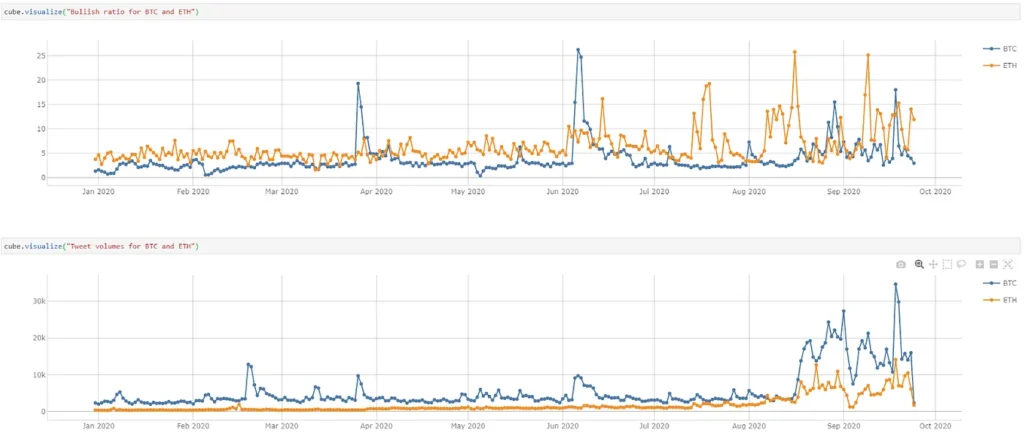
Looking at Tweets from different perspectives, I cannot bring myself to accept that the cryptocurrencies’ returns can simply be forecast by a single feature such as the Twitter sentiment.
In this article, I will be exploring the below to find out if any of the attributes from the Tweets can be used to forecast the returns of cryptocurrencies:
- Probable time-series of features that can be used for forecasting
- Performing Stationary check and making the time series stationary
- Testing causation using Granger Causality test
- Using Vector Autoregressive Model (VAR) to forecast the returns of the cryptocurrency
Possible analytics time-series
From the cryptocurrencies, I considered only two features – price and returns in my case as I am interested to see if the Tweets can be used to forecast these features. From Tweets however, I have many possible features that I can get, e.g. the Tweet’s attributes:
- Number of retweets
- Followers count (of the authors who posted)
- Favorite count
I can also derive the following features:
- Tweet volume
- Tweet polarity (emotions expressed in the post – positive, negative or neutral)
- Tweet’s bullish ratio (number of positive tweets over number of negative tweets)

Similar to the Bull/Bear ratio which is a market sentiment of investors towards the financial market, I created a bullish ratio for the Tweets.
A bullish ratio greater than one indicates audiences’ belief that the cryptocurrency’s return will increase. Otherwise, a value lower than one shows greater negativity towards the cryptocurrency and the market will be pulled back in near future.
Let’s use all these time-series as our features and load them into Atoti.

Note that for each cryptocurrency, I set aside the last 7 days as the test data and the rest as the training data. This means that I’m going to forecast up to 7 days of returns.
Stationary time-series check
Most time-series analyses require the time-series to be stationary. There are many articles on why stationarity is important, so I shall skip the specifics here. Instead, let’s see how we can detect stationarity in time-series:
- Visual checks by plotting
- Auto-correlation function (ACF)
- Augmented Dickey-Fuller test (ADF)
Visual checks by plotting
Using Matplotlib, let’s plot the time-series:
for coin in coins:
    dataset = metrics_df.loc[[coin]]
    fig, axes = plt.subplots(nrows=4, ncols=2, dpi=120, figsize=(10,6))
    for i, ax in enumerate(axes.flatten()):
        data = dataset[dataset.columns[i]].to_numpy()
        ax.plot(data, color="red", linewidth=1)
        ax.set_title(f"{coin} - {dataset.columns[i]}")
        ax.xaxis.set_ticks_position("none")
        ax.yaxis.set_ticks_position("none")
        ax.spines["top"].set_alpha(0)
        ax.tick_params(labelsize=6)

    plt.tight_layout();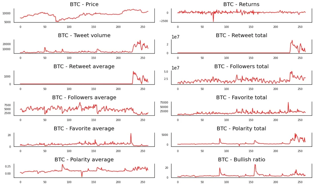
Judging from the shape of the plot, it seems that the time-series of returns, polarity average and probably bullish ratio are stationary for Bitcoin. As you can see, this method has a couple of problems:
- There are 12 time-series for each of the 12 cryptocurrencies (total of 144 charts). This can get pretty lengthy.
- It’s manual and is subjected to my judgement.
Auto-correlation function (ACF)
Autocorrelation is the degree of similarity between a given time series and a lagged version of itself over successive time intervals. It can cause problems in conventional analyses (such as ordinary least squares regression) that assume independence of observations (based on Gauss-Markov condition). With the presence of autocorrelation, we may be underestimating the error variances, making confidence interval calculation etc invalid.
That apart, by plotting the autocorrelation of the time-series by lag, called the AutoCorrelation Function (ACF), we can determine if the time-series is stationary.
for coin in coins:
    coin_df = metrics_df.loc[[coin]]
    for metric_name in coin_df.columns:
        metric = coin_df[metric_name]

        # autocorrelation
        lag_acf = ";".join(map(str, acf(metric, nlags=50).tolist()))
        lag_pacf = ";".join(map(str, pacf(metric, nlags=50, method="ols").tolist()))

        data_stats = data_stats.append(
            {
                "coin_symbol": coin,
                "metric_name": metric_name,
                "lag_acf": lag_acf,
                "lag_pacf": lag_pacf,
                "std": metric.std(),
            },
            ignore_index=True,
        )
Using “acf” and “pacf” functions from statsmodels, I generated the auto-correlation for 50 lags and stored them as a vector:

Why am I not plotting the time-series? From the previous visual check, we can see that there are simply too many charts to plot for all the cryptocurrencies.
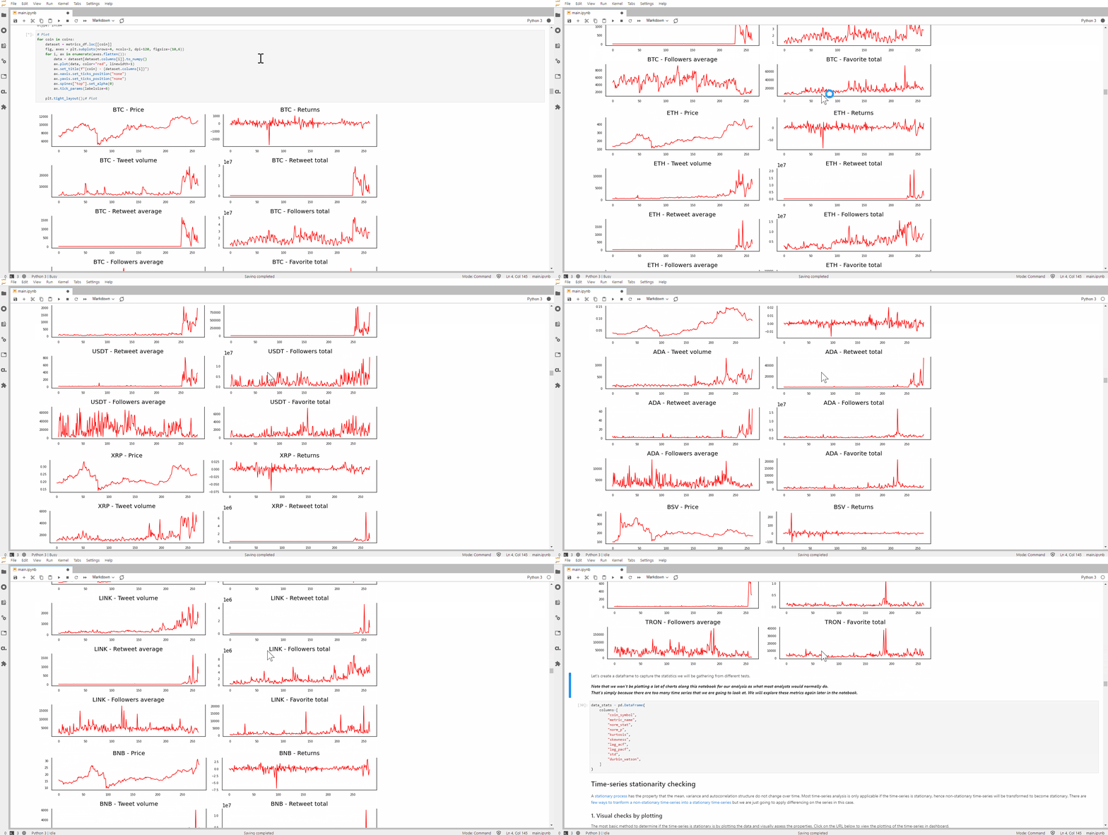
I figured that I would need a better way to manage my data. Hence I loaded the data back into Atoti and created a dashboard that allows me to filter my data by the cryptocurrency.
I can now compare the ACF alongside the time-series plotting.
In the ACF plots for Bitcoin, we can see that the price time-series has a good positive correlation up to lag 36 before it cuts through the upper confidence level of 95%, showing a gradual decline in value and therefore a non-stationary time-series. The ACF for returns however showed a sharp dip from the beginning, implying a stationary time-series.
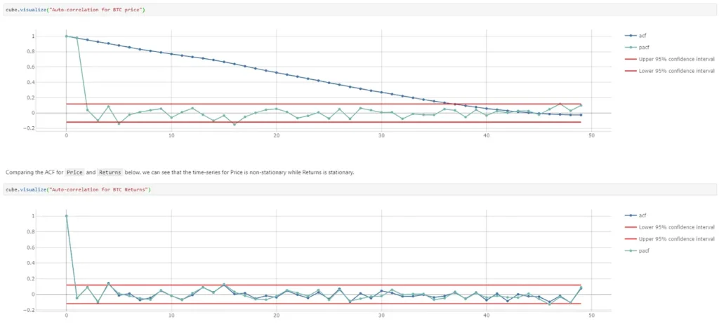
This way of determining the stationarity of a time-series is more definitive compared to the first method. However, given we have multiple time-series, it would be nice to be able to determine the stationarity programmatically and apply differencing to the time-series directly.
Augmented Dickey-Fuller test (ADF)
Using the augmented Dickey-Fuller test (ADF), I am going to test the null hypothesis that a unit root is present in the time-series and hence, implying a stochastic process that is non-stationary. By using ADF, I can recursively apply differencing on the time-series until no unit root is detected.
def augmented_dickey_fuller_statistics(
    coin, metric_name, time_series, diff_order, _diff
):
    global full_diff_df
    result = adfuller(time_series)
    if result[1] < 0.05:
        return _diff, time_series
    else:
        print(
            coin,
            metric_name, "p-value: %f" % result[1],
            "There is unit root (Cannot reject null hypothesis) - Repeat differencing",
        )

        diff_order += 1
        differencing = time_series.diff()

        diff_df = differencing.reset_index()
        diff_df["order"] = diff_order
        diff_df.set_index(["coin_symbol", "date", "order"], inplace=True)
        axis = 1 if metric_name in diff_df.columns else 0
        _diff = pd.concat([_diff, diff_df], axis=axis, join="outer")

        return augmented_dickey_fuller_statistics(
            coin, metric_name, differencing.dropna(), diff_order, _diff
        )
I retained the differenced time-series and the order of differencing before loading them into Atoti as a scenario:
price_store.scenarios[f"d{diff_order}"].load_pandas(
    scenario.loc[
        :, scenario.columns.isin(["coin_symbol", "date", "Price", "Return"])
    ]
)

tweets_store.scenarios[f"d{diff_order}"].load_pandas(
    scenario.drop(columns=["order", "Price", "Return"], errors="ignore")
)
By doing so, I am able to see the change in the time-series with each differencing:
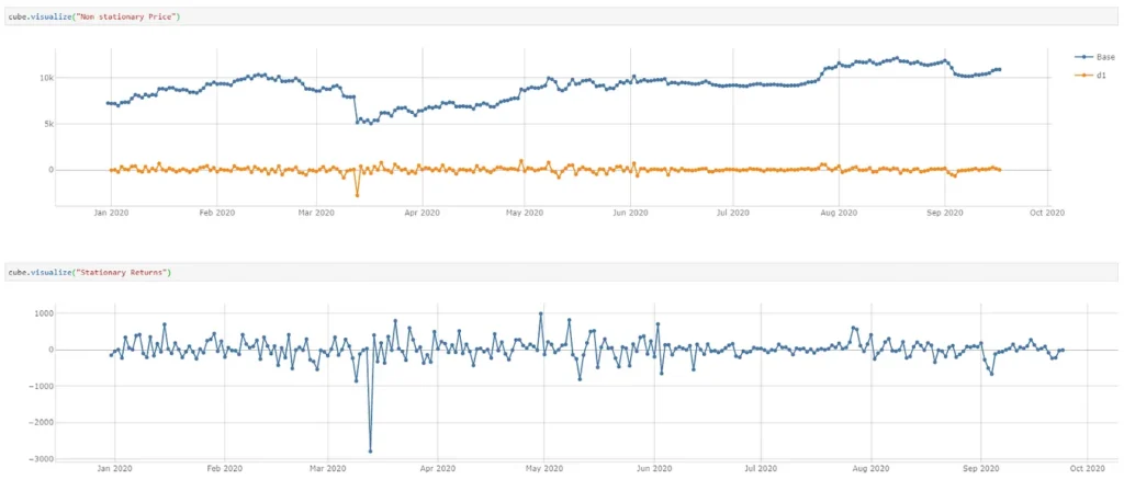
Since the time-series for returns is a stationary process, no differencing is applied. However, the time-series of price after differencing becomes exactly the same as the returns time-series. In this case, I can safely ignore the price time-series.
Granger Causality Testing
Now that my time-series are stationary, I would like to find out if any of the time-series can be used to forecast the returns of a given cryptocurrency using the Granger causality test. The idea behind is that for a given variable Y that can be predicted based on its own past values, a variable X is said to Granger-cause Y if the past values of X and Y give a better prediction.
Y in this case is the returns, and X is composed by the other features that we have identified earlier on. For each cryptocurrency, I iterate through each feature to see if it can Granger cause returns up to maxlag 50 (similar to ACF earlier):
columns = train_data.columns

for c in columns:
    r = "Returns"
    if c not in ["Price", "Returns"]:
        X_train = train_data[[r, c]]

        gc_test_result = grangercausalitytests(
            X_train, maxlag=50, verbose=False
        )
Below shows the output for a lag for Tweet volume against Returns of Bitcoin:

Again, I upload these attributes into Atoti and I can quickly visualize the p-value of each feature of a cryptocurrency against returns for 50 lags:
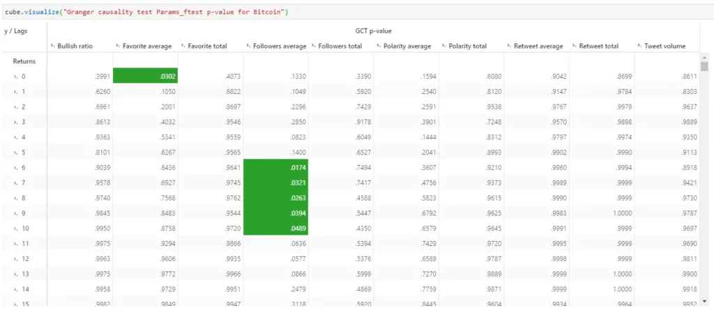
In the above pivot table, the green cells show features that have the null hypothesis rejected based on 95% significance level. The null hypothesis is given as follows:
The time-series in the second column (features) does NOT Granger cause the time series in the first column (returns)
With Atoti, I create a measure that gives a scoring of 1 when the null hypothesis is rejected for a lag:
m["Granger causality"] = tt.agg.sum(
    tt.where(m["GCT p-value"] < m["alpha"], 1, None), scope=tt.scope.origin(l["Lags"])
)
We can see how many lags of each feature has the null hypothesis rejected together with other test output:

Forecasting with Vector Autoregression model (VAR)
Using Statsmodel VAR, I’m going to use the features with null hypothesis rejected from the previous section to forecast the returns.
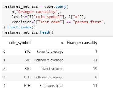
Cube query returns a Pandas dataframe. Notice that x contains only those features with value for Granger causality.
Since Granger causality test returns results from 4 different types of testing, I chose the features using the p-value from the ssr_ftest which is based on F distribution.
Below shows the time-series selected based on 95% significance level for Bitcoin:
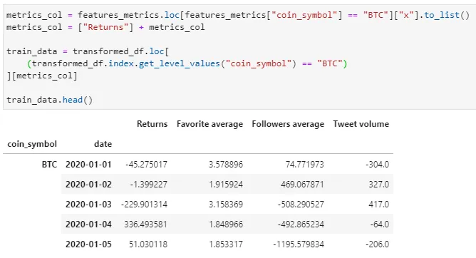
I apply VAR on my train data at daily frequency level as per the granularity of my data.
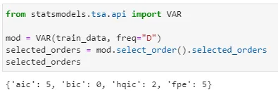
Looking at the selected order, we can see that both AIC (Akaike information criterion) and FPE (Final prediction error) returns an order of 5 while BIC (Bayesian a.k.a. Schwarz) returns an order of 0 and HQIC (Hannan-Quinn) returns order of 2. I choose to fit my model with a maxlag of 5 based on AIC.
max_lag = selected_orders["aic"]
res = mod.fit(maxlags=max_lag, ic="aic")
res.summary()
Let’s quickly take a look at the results for the returns:
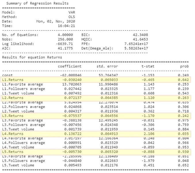
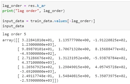
It happens that the lag order for Bitcoin with the given features is 5. Which is confirmed in the results table here above where we can observe that the first coefficient with associated probability less than 0.05 (95% confidence) corresponds to Followers average variable at lag 5. We will take the last 5 days of the features to forecast our returns.
Previously I have put aside 7 days of test data for which I want to forecast. However, to achieve more precise forecasting, I limit the number of days to forecast to the lag order returned by the fitted model. The steps to forecast is therefore the least value between my initial target of 7 days and the value of the lag order:

Let’s fit the value back into our dataframe:
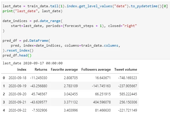
I’m going to load this data back into Atoti as a scenario named “Forecast 0.05” since this is based on features obtained from Granger causality test at 95% significance level:
df_forecast["coin_symbol"] = “BTC”
price_store.scenarios[“Forecast 0.05”].load_pandas(df_forecast)
I can now compare our forecast against the actual. The forecasted values are nowhere near the actual values except for the last 2 days (there is a chance that the number of examples observed is less than 7 days).

We can spot 2 days with the correct trend forecasted. Let’s create some measures in Atoti to measure how accurate the model forecast trends instead of the values.
m["Prev day returns"] = tt.date_shift(
    m["Returns"], on=h["Date"], offset="-1D", method="exact"
)
m["Trend"] = tt.where(
    (m["Returns"] - m["Prev day returns"]) < 0,
    -1,
    tt.where((m["Returns"] - m["Prev day returns"]) > 0, 1, 0),
)
I compared the current return with the previous day and return:
- -1 if it is less than the previous day,
- 1 if it is greater than the previous day
- 0 if there’s no change
Alternatively, I can also replace the value with emoticon:

With Atoti’s pivot table, I greyed out the dates which are not forecasted due to the difference between the lag order and the number of days intended to forecast.
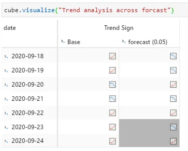
We can see that the trend on 2020-09-21 and 2020-09-22 are predicted correctly and there are only 5 forecasted values.
Validation of our VAR model
Autocorrelation testing in the residual
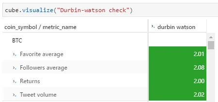
Durbin-Watson Statistic can be used to check autocorrelation in the residuals (difference between the observed and predicted values from the VAR. It allows us to verify if there is remaining information to be explained in the residuals, which would invalidate our model..
Positive correlation here would imply that if the value increased yesterday, it would most likely increase today as well. Negative correlation would imply that if the value increased yesterday, it would most likely decrease today. To validate our VAR model, I aimed to have zero autocorrelation for our residual.
From the fitted model, I obtained the residual and apply the durbin watson:

Together with some other metrics, the data is loaded back into the scenario “Forecast 0.05” in Atoti. This allows me to visualize the durbin watson value in the pivot table as shown below. For my testing, I assumed that there is no auto-correlation for a value between the range 1.5 to 2.5.
Distribution of Residual
For our VAR model to be valid, the residuals must be:
- normally distributed
- non-autocorrelated.
To verify whether the residuals are normally distributed or not we perform a normaltest using SciPy “normaltest” .
import scipy.stats as stats

metric = res.resid[col]
fitted_df[f"{col} residual"] = metric
stat, p = stats.normaltest(metric)
kurtosis = stats.kurtosis(metric)
skewness = stats.skew(metric)
Again, I loaded the data into the scenario “Forecast 0.05” in Atoti together with the durbin watson from the previous section.
data_stats.loc[
            (data_stats["coin_symbol"] == coin) & (data_stats["metric_name"] == col),
            ["durbin_watson", "norm_stat", "norm_p", "kurtosis", "skewness"],
        ] = [val, stat, p, kurtosis, skewness]

stats_store.scenarios[scenario_name].load_pandas(data_stats)
If p-value from the “normaltest” is less than or equal to 0.05 (at 95% confidence level), we will reject the null hypothesis below.
- Null hypothesis: Data looks Gaussian
- Alternative hypothesis: Data looks non-Gaussian
We can do so with the following measures:
m["Gaussian confidence"] = 0.05
m["Distribution type"] = tt.where(
    m["norm_p"] != None,
    tt.where((m["norm_p"] < m["Gaussian confidence"]), "Non-Gaussian", "Gaussian"),
)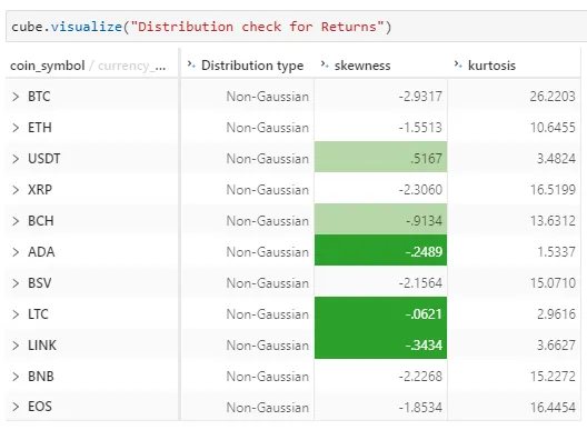
From the above, we see the Kurtosis value from the residual based on Fisher’s definition of kurtosis. 0 is returned if all values are equal. Kurtosis value of less than -1 shows that the distribution is too flat while a value greater than 1 is too peaked.
Skewness value between -0.5 and 0.5 shows that data are pretty symmetrical. Values between -1 and -0.5, or between 0.5 and 1, shows that data are moderately skewed. Otherwise, the data are highly skewed.
It seems that the residual of returns are non-gaussian even though it is pretty symmetrical for ADA, LTC and LINK.
But, these results have to be taken with caution because the small size of the test data (only 7 points at most for each cryptocurrency) makes it difficult to assess normality of the data using such a test.
We should at least consider a non-parametric test or increase the size of the test data.
Putting together the analysis for all cryptocurrencies
We see the forecast performed for one single cryptocurrency above. I iterated the same set of testing for different cryptocurrencies and stored the analysis into Atoti so that I can put all the test results together:
While this is a benefit of storing the test output into Atoti, what I am going to leverage is really the scenario simulations which we shall see in the next section.
Scenario simulation with different significance level
Changing the level of significance (alpha) affects the features that are being selected for the VAR model as the basis for rejecting the null hypothesis changes.
With Atoti, we shall see how the features are changed if the level of significance is changed by setting up a simulation that replaces the alpha value. The base scenario (initial forecast at 95% confidence level) is labelled as “0.05”.
significant_simulation = cube.setup_simulation(
    "Significance simulation", replace=[m["alpha"]], base_scenario="0.05"
).scenarios
Let’s replace the alpha value with 0.1 and 0.01 in the scenario “0.1” and “0.01” below, rejecting the null hypothesis for Granger Causality test at 90% and 99% confidence level respectively:
significant_simulation["0.01"] = 0.01
significant_simulation["0.1"] = 0.1
I can now re-query Atoti to get the new set of features based on the two simulations above.
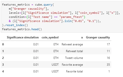
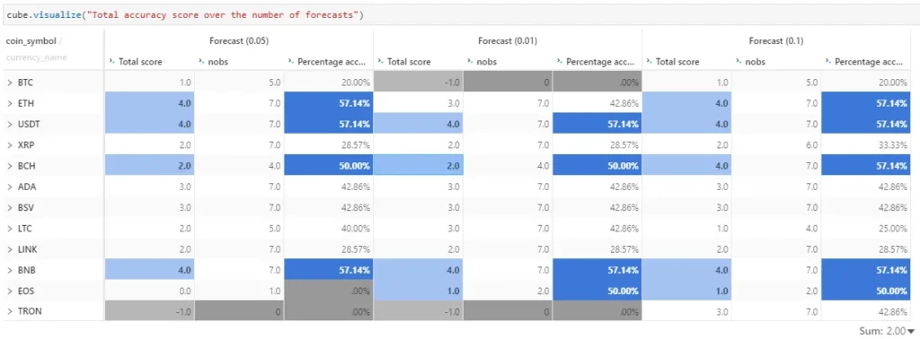
I can now repeat the forecasting with VAR using the new set of features and compare the differences:
Finally, to summarize our analysis, the features identified by Granger causality test at 90% significance level have forecasted the highest number of cryptocurrencies correctly at 50% accuracy and above (in term of trend).
Let’s have a look at the features that helped in forecasting the trend of those cryptocurrencies with more than 50% correct.
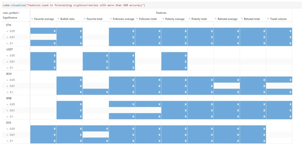
To conclude, Twitter sentiment alone cannot be used to forecast the returns of the cryptocurrencies. However it is one of the features that can Granger cause and therefore be used to forecast the returns of Ethereum, Tether, Bitcoin Cash, Binance Coin and EOS.
However, the predictive power of our VAR models here are underestimated. In fact, as we found out that cryptocurrencies were Granger-caused by some variables at lags greater than 1. When predicting a given point in time, we need to use its actual corresponding past values and this is what we have not done in this use case. Consequently, in our predictions we accumulated predictions errors over the different time steps. For instance, the predicted returns at day 5 misses information of the past values at days 4, 3, 2, 1 and 0 (correlated lags), which represent errors that sum up together resulting in a decrease of the accuracy of the prediction.Still, there are many other things that could be done to improve the forecast, I welcome you to share with me your thoughts if you have done something similar. You may also find my notebook here.


