The Recipe for Stressed VaR calibration
In this post, I want to illustrate how to create an analytical application with Atoti and Python that can help to visualize and interactively slice-and-dice the impact of increasing volatility on the Value-at-Risk (VaR) metrics of an investment portfolio. This might be particularly interesting for the risk professionals in the finance industry who have to periodically recalibrate stressed VaR and want to understand and explain the choice of the historical stressed period relevant to their portfolio to the regulator. This should also provide insight for users looking to get a better sense of how multi-dimensional analysis works in Atoti.
Why Stressed VaR calibration is a challenge?
As a refresher, after the Great Financial Crisis of 2008, regulators required banks to start allocating capital based on a historical period of “extreme” losses, also known as “stressed” period. For most banks, the 2008 crisis itself became in fact the period of reference.
However as market conditions evolve and portfolio structure changes, risk professionals have to periodically recalibrate and justify the choice of the stressed period. The approaches may vary within the industry – see, for instance, the EBA Guidelines on Stressed Value at Risk – but typically the VaR has to be computed for a number of rolling historical observation windows and the period resulting in the most conservative VaR becomes the new stress period. To explain the result, analysts need to be able to slice-and-dice the results to evaluate the contribution of different portfolios, asset classes or even specific risk factors onto the VaR.
This is a huge effort! After spending days and nights generating and cleaning simulated P&L data for a 15-year observation window, the next challenge for an analyst would be to aggregate it across trades and compute VaR for each of the rolling observation windows.
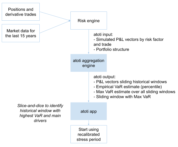
In the following chart, I’m summarizing the data needs for the stressed VaR calibration exercise: I will scan through 15 years of historical simulations data produced by risk engine to find a window that will result in a highest VaR estimate for my portfolio as a whole and individual sub-portfolios, such as legal entities.

Visualizing rolling VaR
I created this chart in Atoti to visualize VaR for different historical observation windows for the “Global Portfolio” and for a “Travel Services” sub-portfolio. The orange line displays the maximum VaR across observation windows.
From the above screenshot, I can see that for the “Global Portfolio” – the total across portfolios – the extreme losses still fall onto the 2008-2009 period, but for the “Travel Services” sub-portfolio the stress period would have to be updated to include the Coronavirus Market Crash 2020. Is this a valid result? Or am I missing any market prices, products or positions?
To get comfortable with the numbers, I would need to zoom in on the tail scenarios of the relevant observation window, and drill down to the positions and risk factors to validate the result. If I were missing market quotes, I would need to spend potentially hours to re-generate simulated P&L vectors and re-aggregate VaRs!
Luckily, there is a tool that can help to re-aggregate and analyse interactively large volumes of P&L vectors and compute the metrics that I need – rolling VaR/worst VaR window on-the-fly. This is a task where Atoti shines.
Slice and dice rolling VaR with Atoti
Before I walk you through the code in the Python notebook, let me first show you what the resulting app may look like. Once I load portfolio data into a cube, I can open Atoti’s web application to visualize, drill-down, filter and explore P&L scenarios and market data, and my custom aggregation functions – computing the VaR and the end of the worst VaR period – will recompute analytics on the most granular data every time I click.
Below I am showing a dashboard, in which I placed a pivot table on the left, and a chart on the right:
- In the pivot table, I’m displaying the “Worst VaR” metric and the date, corresponding to the end of the worst period. When I expand the data along the portfolio structure, or by any other attribute, for example, by risk factor (in my case, Stock name), a series of VaR numbers are recomputed for each of the rolling windows, then the Worst VaR metric and the Period End is selected. This view is illuminating, as for the Total Portfolio the worst period is still falling onto the Great Financial Crisis – “Worst VaR Period End” is 2009-09-30 – but for some of the sub-portfolios the most extreme losses occurred during the pandemic – the “Worst VaR Period End” function determined 2020-06-12 as the worst (which I’ve highlighted with yellow using conditional formatting).
- In the chart, I’m visualizing the series of sliding VaR values, from which the worst case was computed. Every time I click on a node in the pivot table – the data in the chart is filtered accordingly, and the rolling VaRs get recomputed.
UPDATE: The below GIFs and some images in this article are based on an older version of Atoti. We have released much smoother and even more functional dashboards and widgets with the latest version of Atoti. Check out this link to see the documentation of the latest version of Atoti.
Now let’s dive into how it works under the covers and how you can implement this yourself.
The recipe
I will be using a notebook which you can download here, it has the necessary code examples for:
- Creating an analytical application backed by an in-memory OLAP cube that allows the users to visualize and interactively decompose VaR metrics along time, portfolio and risk factor attributes.
- Loading a portfolio’s historical P&L vectors
- Enriching the historical P&L vectors with risk factor, trade, book, legal entity and other attributes to facilitate detailed analysis.
- Defining an aggregation function in python which computes a VaR for rolling windows of a specified length.
Please refer to the Getting started with Atoti article for the installation tips and let me walk you through the main steps to achieve the rolling VaR aggregation.
New Atoti session
Start by creating an Atoti session:
import Atoti as tt

session = tt.Session(user_content_storage="content")
Loading historical P&L data
As a first step, I need to load the simulated P&L data into memory – a store, in Atoti terminology. Think of it as a table in an excel worksheet.
My data model example is very simple and only has a handful of rows, but the Atoti backend can scale to millions of trades and as many attributes as needed. For example, by bringing the dimensions – such as source system, positions attributes, liquidity horizons, risk factor attributes and similar other data sets – you can enrich the VaR data for better business insights.
I will upload equity positions by trade into the Position store and historical return vectors for each stock into the StockData store, as described in the data model below. In a real-life setting, you may be uploading P&L vectors, not the stock price returns as in my simplified scenario.
The following code allows me to read such data from CSV files. Follow this link to read more about Atoti data sources.
market_data = session.read_csv(
    "s3://data.Atoti.io/notebooks/stressed-var-calibration/stock_price_returns.csv",
    keys=["Stock"],
    table_name="StockData",
    array_separator=";",
)

market_data.head(3)

As a best practice, I load the returns as vectors. This reduces the size of the files and memory requirement, and speeds up the calculations.
positions = session.read_csv(
    "s3://data.Atoti.io/notebooks/stressed-var-calibration/positions_snapshot.csv",
    keys=["Book", "Stock", "TradeId"],
    table_name="Positions",
    types={"MarketValueUSD": tt.type.DOUBLE},
)

positions.head(3)

In the following cell, we are linking positions data and market data using join: an Atoti join is not like a Pandas join/merge that creates one big table but more like SQL join: it keeps two separate tables but there is a reference from one to another so the joined table will enrich the base data with more attributes. Follow this link to read more about Atoti join.
positions_store.join(market_data_store)
VaR vectors across trades
Simulated P&L vectors are usually delivered by risk systems. However, in my example, I’m using the stock price returns vector instead. Therefore I took an additional step to derive the P&L vector by multiplying the market values (`AmountUSD`) across the returns vector (`Returns.VALUE`) for each stock.
m["P&L Vector"] = tt.agg.sum(
    m["MarketValueUSD.SUM"] * m["Returns.VALUE"], scope=tt.scope.origin(l["Stock"])
)
The `P&L vector` is a measure returning all P&L values – here I’m using a 3635-days long history. Viewing the P&L vector in one cell is not a user-friendly representation of the simulated P&Ls.
Therefore I will also create a VaR aggregation from the vector and make it possible to view individual scenarios. Continue reading to learn how.
Expanding VaR by historical date
With the `P&L Vector` I have access to the array of historical P&L values. Let’s upload dates from a business calendar, and enrich the vector by date labels:
calendar = pd.read_csv(
    "https://data.Atoti.io/notebooks/stressed-var-calibration/business_calendar.csv"
)["Date"]

cube.create_parameter_hierarchy_from_members(
    "Historical Dates",
    list(calendar),
    index_measure_name="Date Index",
)
Now I can create measures, that will pick a value from the vector for desired scenario dates:
# This new measure will pick an element from the VaR vector:
m["P&L at date"] = m["P&L Vector"][m["Date Index"]]
m["P&L at date"].formatter = "DOUBLE[#,##0.#]"

m["Return at date"] = m["Returns.VALUE"][m["Date Index"]]
m["Return at date"].formatter = "DOUBLE[#,##0.#%]"

m["Price at date"] = m["Prices.VALUE"][m["Date Index"]]
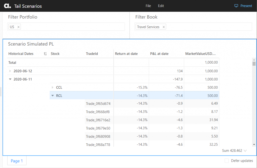
I can zoom in on individual scenarios, and drill into them further, for instance, breaking P&L down by trade, risk factor and displaying next to the actual market data shocks.
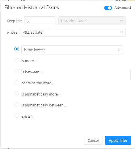
I want to examine the tail scenarios – the worst 5 historical P&L values – for the “Travel Services” book. To obtain the Tail Scenarios, I’ve set a BottomCount by P&L filter on historical dates as follows:

In addition to the simulated P&L – “PnL at date” metric; I’m adding the measures displaying exposure and market data – “AmountUSD.SUM” and “Return at date”. I can immediately see that for the scenario “2020-03-12” my exposure in instrument CCL (Carnival Corp stocks ticker) was 500 USD, and CCL price dropped more than 30%. I can drill down to other dimensions, for example, to trades to see where the exposure is coming from.

Sliding VaR
Now let’s create a Sliding VaR measure that will compute VaR from a rolling observation window of 260 days. This means that for each business date, a sub-vector containing the 260 simulated P&L values before and up to itself (inclusive), is created.
# Lets create a measure for the observation window length:
lookback_windows = cube.create_parameter_simulation(
    "Lookback Window",
    measures={"Lookback Window": 260},
    base_scenario_name="260 days",
)

# This is a measure picking a subset of scenarios preceeding and including each observation date,
# i.e. historical rolling window:
m["P&L Sub-Vector"] = m["P&L Vector"][
    m["Date Index"] - m["Lookback Window"] + 1 : m["Date Index"] + 1
]
The sub-vector measure is using python’s array[start:end] notation, where the start is the current date index minus the number of observations in the rolling window and end is the current date index, both shifted 1 day forward, to include the end of the observation window.
Having created the Sub-Vector for each rolling window, I can use an aggregation function on top of the vector to compute the percentile:
m["1d 99% VaR Sliding"] = tt.math.abs(tt.array.quantile(m["P&L Sub-Vector"], 0.01))
If you prefer, you can specify the percentile calculation parameters as described in the Atoti reference documentation [Atoti.agg.quantile], or replace VaR with Expected Shortfall (ES).
In search of the stress period
Finally, let’s create a metric that will compute the worst VaR across all observation windows. Here is how I do it in my notebook:
# This measure is computing the worst VaR value:
m["Worst VaR"] = tt.agg.max(
    m["1d 99% VaR Sliding"], scope=tt.scope.origin(l["Historical Dates"])
)
m["Worst VaR"].formatter = "DOUBLE[#,##0.#]"

# This measure is computing the worst VaR window (identified by the end date):
m["Worst VaR Period End"] = tt.agg.max_member(
    m["1d 99% VaR Sliding"], l["Historical Dates"]
)
I also want to propagate down the Worst VaR value back to each of the historical dates, to be able to display them next to individual scenarios:
m["Worst VaR propagate to each date"] = tt.parent_value(
    m["Worst VaR"], degrees={h["Historical Dates"]: 1}, apply_filters=True
)
I can use the “propagated” Worst VaR metric to plot it on the same chart as the sliding VaR for each observation window:

Conclusion
This was my recipe for exploratory rolling VaR analysis. We saw how one can create an analytical app allowing us to interactively reaggregate and drill down simulated P&L. Whether there’s a new peak period or not depends on your portfolio and I hope Atoti can help you during the next stressed VaR calibration.
In our future posts, we will discuss “component” measures and VaR attribution, as well as using kernel functions for estimating tail-measures like ES, stay tuned!


